How do you design your logo? What is important when designing a logo? What are the basics to keep in mind? Here are the 7 most basic “principles” or principles when designing logos. Each principle can even be written into a book, so I’m just going to shorten it and go through the main sections.
1. A logo needs to be able to communicate
Like any design, a logo must convey a certain message. Through communication we are sharing or imparting consciousness. And a message can be a story, idea, emotion or mood.
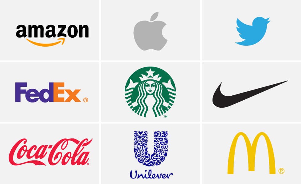
A logo can convey a message through symbolic symbols to represent the core values, products or services of the brand. Or it can convey a message through design – simplicity, elegance, high-tech, classic can all be easily expressed through design. Or it can tell a big story that we can only understand after being explained, such as Amazon’s A-Z logo, Twitter’s bird logo.
Either way, the logo has to communicate something. Learn more about the ways a logo can communicate:
2. A logo can tell you the name of the brand
Logo is an abbreviation of logotype, a form of communication through the arrangement and adjustment of characters (Logo in Greek means word). The term logo has now gradually become a synonym for trademark, whether it is a logotype, symbol, monogram or other graphic tool.
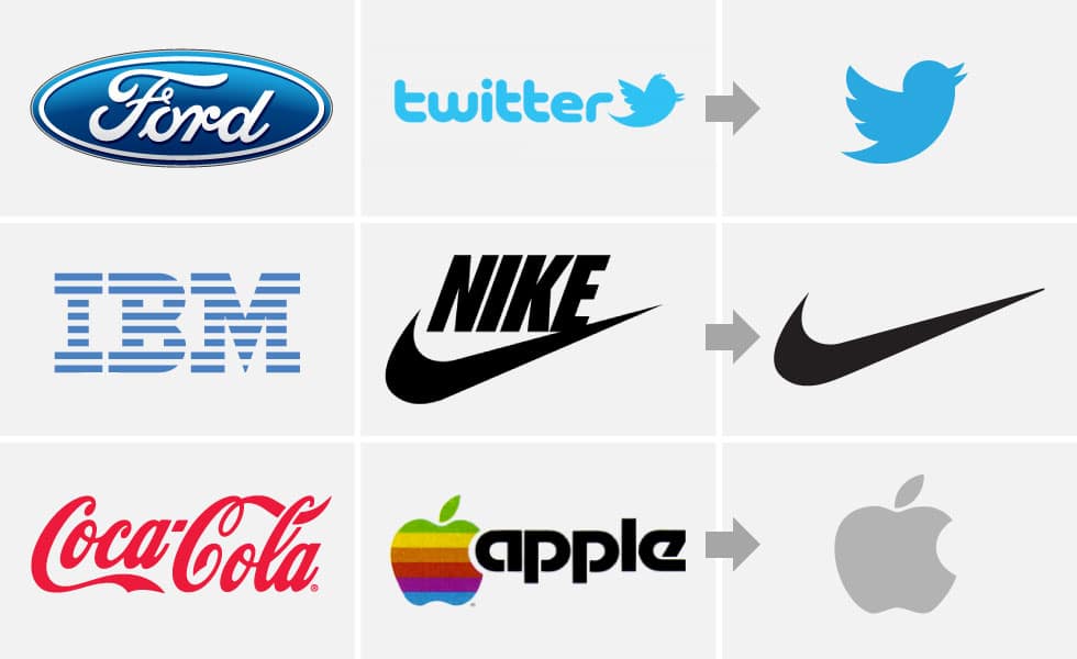
This argument should tell us something about the role a logo plays in conveying brand information. Coca-Cola, IBM, Ford – their logos represent the brand. Logos that are well-known and independent of others such as those of Apple, Twitter and Nike are all derived from the brand element. It is through regular use and growing awareness that they become brand names (this is a process known as debranding).
A logo needs to show the brand name through images
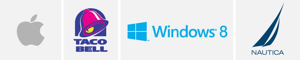
This is the most common use of logos. The Apple logo means nothing but “Apple”. The image we see is an apple. The Windows logo shows a window. Taco Bell’s logo is a bell. Nautica’s logo is a sailing ship – which makes sense since the word nautic means “relating to a sailor”.
A logo needs to tell us about the brand
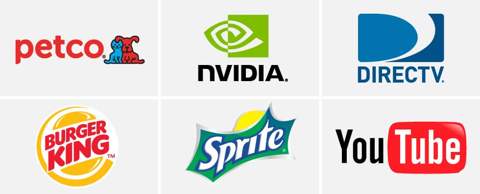
Good examples are PetCo, Nvidia, DirectTV, Burger King, and Sprite. Every logo tells us a little bit about that brand. PetCo is quite clear when it comes to putting a picture of a cat and dog next to the name. Nvidia draws an eye, which is directly related to the graphics card. For Burger King, the brand name is sandwiched between a hamburger and Sprite has a lemon.
The logo examples above are very clear, but some other logos have a rather vague way of expressing brand information.
A logo that expresses nature, mood and emotions
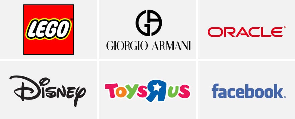
Some logos are rarely related to the product, and in this case the logo will be designed to represent the brand identity. For example, the LEGO logo uses a playful font with red and yellow colors. That helps the logo convey fun, youthfulness and dynamism, although in English, the word LEGO does not have such meaning.
A logo can tell a story or help us know it
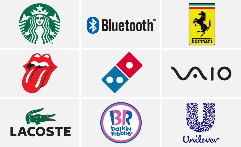
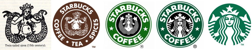
Logos capable of performing this function are considered the best logos. They often leave the deepest impression. Behind the Starbucks logo is a story involving a wooden Mermaid according to Norse legend. The story of the Bluetooth logo involves the king of Denmark.
The famous Ferrari logo originates from the famous plane battle in the first world war. Even the 3 dots on the logo have their own influence – that was the first franchise number when this logo was born. And did you notice that Unilever’s logo contains 23 different illustrations – each representing a business area of the brand.
The great thing about these logos is that those who know the story and show interest are more likely to share it, thereby gradually becoming brand ambassadors. There are many articles about the Siren story of the Starbucks logo. Every first post reinforces their brand as well as their logo, which is something small companies have to pay for.
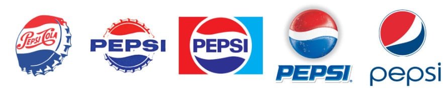
There are quite a lot of conflicting discussions about Pepsi’s new logo, personally I think most people prefer the old version. The reason why? By my deductions, the old logo has something to do with it – the blue means that it’s different from the Coke brand. And the ripple shows that its function is to drink. The circle is the shape of the cap and the history of the logo gives birth to such a simple logo. The new logo doesn’t communicate with customers in that way. No one understands its shape well. Is it a smile? Or a new kind of ripple? A distance? The body of the beer bottle? I believe Pepsi will realize this and return to the old logo. (You can spot the old logo flickering through the “e” in the new version.)
A logo needs to be related
This view is correct if the first principle applies. However, it is often overlooked when novice designers start the logo making process with the mindset of “I have to do something cool” instead of “it has to convey the brand message”.
Here are some logos from 99Designs:
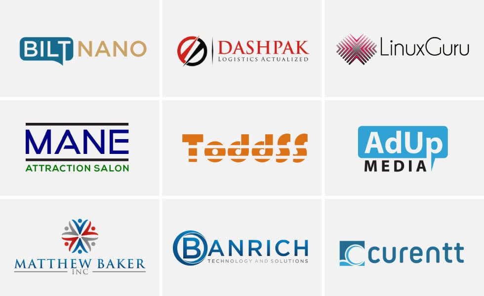
The logos on the top have nothing to do with their brand. Can you guess that Mane is a hair salon by the logo? Metaphorical rhetoric was used – Mane means lion’s mane. But the logo is presented with a rather boring font with the letters A and E having a bit of a twist. What about the logo of “current”? Can we tell if this is a brand of dating software? Bilt Nano and AdUp also use similar design elements and have nothing to do with the essence of the brand.
The problem with most designs made with any website like 99Designs.com is that the design process – 90% research and 10% design by the standards – is only 5% research (whether it’s not. section “brief” is also posted on this site) and 95% “design”. In fact, most designs are simply writing the brand name out and adding a bit to create a logo.
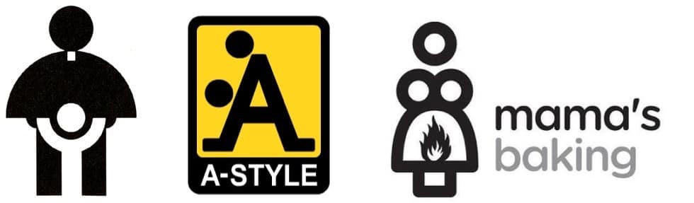
And finally, I’ve read through a few articles that say this point is “a logo must fit”. In part it is also true, but one should say that a logo should not be out of place. An image of a bird is by no means “fit” for a social site, but it is by no means off topic. Here are a few examples of off-topic logos:
3. A logo need to make a memorable impression
Is it unique? Has someone else designed it yet? Does it evoke any images? These are the questions to ask when designing any logo.
The process of creating a memorable logo takes a bit of luck, persistence, and creativity.
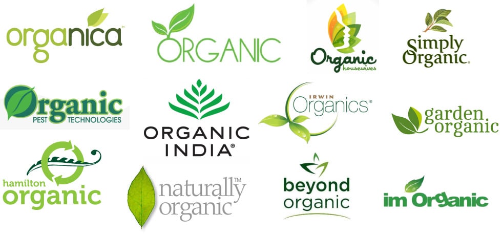
Besides that, you need to keep in mind a few things to avoid when creating a logo. First of all, let’s ignore the first idea that comes to mind. The probability that your first idea also comes from other designers is 9 out of 10. If you’re making a logo for a coffee company, the coffee bean detail is unlikely to make the logo memorable at all. If you make a logo for a water purifier brand, don’t use a water drop image. And if the logo is for an organic food company, don’t use the leaf.
A hidden surprise
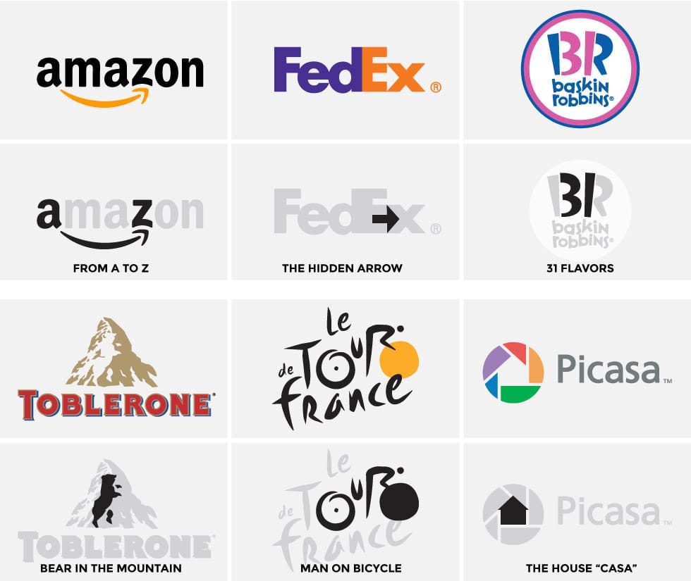
A very effective way of designing a memorable logo is to make it a hidden “surprise”. In other words, customers may not notice at first but then get a small surprise. This little surprise will be the highlight that makes people remember your logo. Perhaps the logo that does this that people often think of is the FedEx logo with an underground arrow.
4. A logo needs to last over time
An important point when designing a logo is its durability time. If an idea can’t last for at least 50 years, it’s not a good choice for logo design. Good logos are all based on long-lasting ideas. The Apple logo is an apple, a beginning of humanity. If this logo was designed in the shape of a computer, it would probably only last for 2 years. Twitter’s logo is a bird, Starbucks’ logo is a sea creature, and Ferrari’s is a horse.
The above logos are timeless. On the other hand, logos that use contemporary icons will quickly fade. Here are a few examples of that.

The key image to represent the car is getting old – most modern cars don’t need a key. The uniform and hat of the feller also became too familiar. The style with glasses is also outdated. And the image of the luggage was only in vogue for a few months.
Design trends
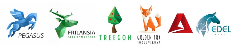
Another example of designs that don’t last is that they follow current mass design trends. A good example is the polygonal design trend, which started out as an effect and has now turned into a logo design trend. Aside from the problems associated with this logo design trend, it will make your design obsolete in a year or two.
Design issues that don’t last long are documented in logo design updates. Small changes to make the logo more contemporary and relevant are not worth mentioning. The key here is to create a logo that doesn’t mix with contemporary design trends. Simplifying the Starbucks logo is logical and effective. Even Google’s logo refresh makes sense – they’ve trimmed away the sharp edges and shadows to achieve harmony (see rule 6 below for more information).
On the other hand, the eBay logo is completely reworked from the old version, using the most commonly used fonts and colors are also adjusted. Personally, even the Microsoft logo has the same problem. Over-simplification has made the logo no longer unique and modern.
5. A logo should not contain redundant elements
I originally intended to write this principle as a logo that should have simplicity. And in most cases it is.
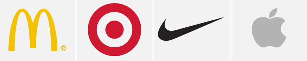
The simpler the logo, the easier it will be to remember and explain. If I want to go to McDonald’s, I can direct you to the fast-food restaurant with the yellow M. If you want to go to Target, look for an image of a red stele, if you want to go to Nike, look for a swoosh sign, and Apple is an image of a partially bitten apple.
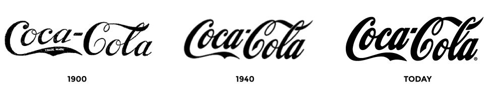
But there are still logos that are not simple but still effective. The Coca-Cola logo is a prime example. It hasn’t changed much since the original 1887. The logo is far from simple, but through its repetitive form and inherent distinctiveness, it has become one of the most famous logos in the world.
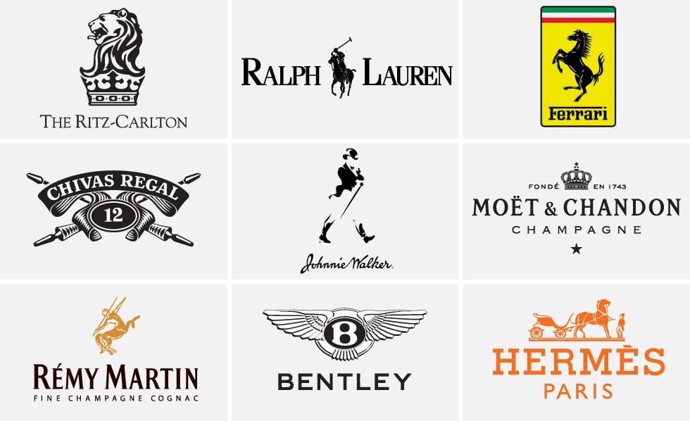
Another example is the Ritz-Carlton logo with an intricate lion image on a crown. In fact, the complexity of the logo is part of the message. It shows that the brand is unique and luxurious. Logos are not easy to copy and hard to reach. This type of design approach can be found in the logos of Ralph Lauren and Ferari. High-end beverage brands also apply this design.
Whether you are designing a simple or complex logo, it is important to never add details that are unnecessary or lack a certain purpose. When designing a logo, ask yourself what elements you can leave out without changing its message. The interesting fact is that the more famous brands become, the simpler the logos become while still keeping their meaning. When Apple first introduced its logo, it came in many colors and the “Apple computer image” was part of the logo. Now we only see the image of an apple. The Nike logo and the “swoosh” symbol, Starbucks and the mermaid are no exception.
6. A logo needs to be well designed
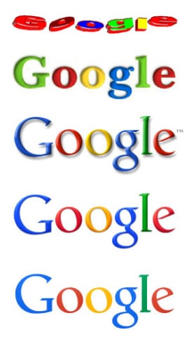
A logo needs to be designed carefully, the principles in this article will help create a complete logo. However, there are two other elements to the design – concept and presentation. No matter how unique and interesting your idea is, it will not succeed if it is not presented well. I have a rule in poster and cover design – the better the idea, the lighter the presentation; or conversely, the worse the idea, the better your presentation should be.
This principle can be applied in the logo design process. The original Google logo was a pretty poor idea with a lackluster presentation. But it has become globally famous. Now the company has recruited talented designers and the logo gradually achieves perfection in presentation without changing the essence of the idea.
You can also see this in other logo improvements. If the logo is already famous, the idea should not change. Instead, improve the presentation.
Let’s dig deeper into this.
Size harmony
This is a term that refers to the uniformity of the size and distribution of elements in a design. For example, if you pay attention to the Starbucks logo, the density of detail on the face is similar to that of the crown and the two fins. As for the proportions, it’s standard.
If you look at the logo of Ralph Lauren, you will see that the proportions of the man and the horse are the same. Talking about the Apple logo, you will see that the detail density of the apple and the leaf is similar. The first two details are the simplest shapes and represent exactly what they are.
Size correlation to determine the level of detail and complexity. If your logo is a detailed illustration, the overall logo needs to have the same level of detail. If the logo is composed of simple shapes, all the rest should be less cumbersome. Here are a few logos that have low uniformity and, as you can see, they each have their own issues.

Color harmony
A logo should achieve a minimum level of color harmony. Some logos look great in black and white (see below for details), and the color is an important part of branding. The colors of some brands stand out so others can easily remember them. The turquoise in Tiffany & Co’s logo is a good example. In fact, the most memorable colors are single colors, but there are also many brands that use two colors and in that case, both colors need to work together.
- The red and yellow in the McDonald’s logo are the same two colors on the color wheel as the blue and yellow in the Subway logo. The orange and purple colors in the FedEx logo are two colors that work well together.
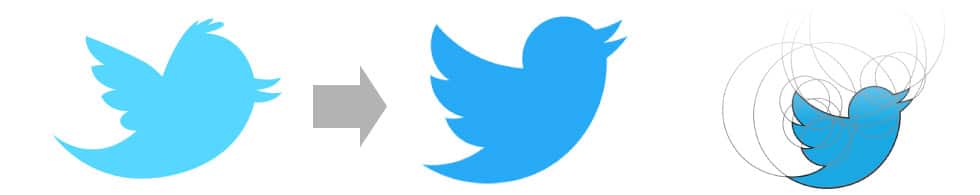
Shape accuracy
If the logo has a circle then the circle needs to be perfect. If your logo contains square detail, make sure it is a correct square. The arc should be classified as a circular segment. Let’s compare the old and new versions of Twitter’s bird logo, and you’ll see the difference in shape to achieve a certain degree of accuracy.
Typography
As mentioned above, the term logo comes from the word logotype – this refers to the spelling of the name of a product or company. A logo represents the name or symbol of a product or company and is directly related to the letter. This demonstrates the importance of typography in the process of creating a logo.Common errors: - Incorrect capitalization;
- Capitalization is not uniform;
- Using too many fonts (2 fonts in a logo is too many);
- The font is too exaggerated (vertical or horizontal);
- Poor kerning part;
- Inappropriate character spacing;
The font used is not appropriate.
7. A logo needs flexibility
- A beautiful logo can be used in any situation. Whether it is placed in the header of a website, a business card or a building sign. Let’s dig deeper:Black and white
A logo needs to work well in black and white. Whenever I come across a logo that uses color as a tool to make it stand out, I say it’s a flawed design. I’ve heard a lot of arguments that this is an outdated design principle because we no longer use fax machines, but the following still do:
1. Embossing and embossing machine;
2. Engraving machine;
3. Metal nameplate making machine;
4. Sewing machine;
5. Icons.A good logo needs to stand out in any case. I mentioned the eBay logo renewal issue earlier. Other companies have found themselves in a similar situation when trying to modernize their logos by not using prominent elements. Take a look at the black and white versions of the following logos:
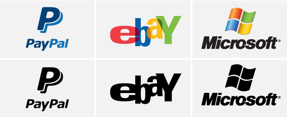
All of the logos above stand out in black and white versions, although the colored versions look better. In the case of PayPal, two P’s are used to make them a logo and make the brand recognizable by others. Moreover, if you separate the window details in the Microsoft Windows logo and use black and white, people will still recognize the brand.Let’s take a look at the modern versions of the logos above:
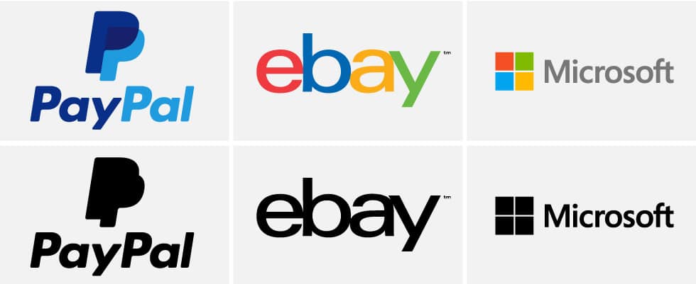
Two letters PP become the logo. eBay is no longer a logo, and neither is the black and white version of the Microsoft Windows logo. Even the Microsoft word has lost its prominence and has become a regular line with a font that looks pretty bad like Frutiger.And in personally, the logo should be designed in black on a white background. Once I have a nice design in the black and white version I can add color, but I would avoid the option of adding color.
Vector
A logo needs to be designed on a vector program. Adobe Illustrator and Corel Draw are vector-based design programs. The reason for this is that vector graphics are not resolution-independent – which means the logo can be resized without losing its meaning.However, there are programs where only vector logos can be applied. That is:
- 3D rendering programs and 3D printing programs;
- Acid-resistant engraving machines;
- Vinyl cutters for window screens;
- Sewing machine
Maybe I missed a few cases. A vector image can be saved as a scanned image file with just a few clicks, but not vice versa.
Shaping ability
A logo needs to be designed so that we can easily adapt it. It is argued that a “perfect” logo should be designed in a square or circular shape so that it can scale well horizontally and vertically. But in many cases, designing a square logo is not feasible. Furthermore, sometimes a horizontally oriented logo is needed while the vertical version works better in other cases.
This rule should be applied when designing a logo. Does the vertical version make sense? What would it look like if designed horizontally? If the logo is not scaled down, are there any unique details that can be used as the logo? (the “f” stands for Facebook, the Q for Quora, the bottle shape for Coke, etc.). Here is an example of a Tethos logo designed this way.
You can see that the main logo version is designed horizontally. The reason is that there are cases where we don’t need the wide version, the logo is also redesigned in a different direction to represent a different purpose, and the final image is just a symbol. All three versions above are featured in white and black versions.
If you are looking for a reputable and experienced place to design your logo, brand identity system and design your business’ branding strategy artistically and impressively, then contact us. Contact us immediately by phone number 0938 835 856, or leave your information and requirements, THE MONEST‘s consulting department will contact you right away to answer all your questions!
————————
THE MONEST
Website: www.themonest.vn
Fanpage: https://www.facebook.com/themonest.agency
Behance: https://www.behance.net/themonestagency
LinkedIn: https://www.linkedin.com/company/the-monest-agency/
Instagram: https://www.instagram.com/themonest.agency/
Hotline: 0938 835 856
#LogoTheMonest #CIPTheMonest #StationaryTheMonest #BrandIdentityTheMonest #Painting
#PaintingTheMonest #InstalationArtTheMonest #DieuKhacTheMonest #XayDungThuongHieu #TheMonestXayDungThuongHieu #ThietKeThuongHieu #TheMonestAgency #ClientTheMonest #HoihoaTheMonest #ArtTheMonest #BrandAgency #DesignAgency #TheMonestDesign #ThuongHieuVaDiSan #Branding #DesignAgency #PackagingDesign #HoiHoa #AdvertisingAgency #LogoDesign

