The logo symbol is the heart of the brand, expressing who you are, what you are doing, carrying the message you want to send to customers when they think of your company. But how to choose and use the logo icon to match your brand? And how do you make sure you choose the right one? Do not ignore the sharing in the following article of The Monest!
1. Why use logo icons?
Having a symbol in a logo is not a prerequisite for a great brand identity. A lot of household names just use text. However, if you’re just starting out, a logo can be a great way to start capturing some sort of brand equity.
Think of it this way: a logo symbol is like a magnet that grabs people’s attention and gathers all their emotional connections to your company. Do you have to have a logo icon? Unnecessary. But can it help you establish your brand identity when you’re just starting out? Sure!
2. 5 types of logo icons
There are many different icons and they usually fall into one of the following categories:
- Animal
- Mascot
- Abstract & icon
- Interact
- Crests, trademarks and logos
Let’s break them down to help you understand why they work and how you can use them in your own logo.
#1. Animal logo icon
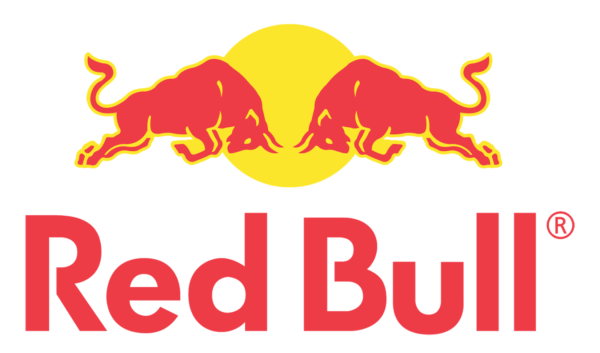
Animals tap into instinctive structures deep in the brain, giving them a directness that requires almost no conscious abstraction.
The Red Bull logo has a rich history of using animal symbols to convey strong brand messages and refer to local history. It’s a great example of why animal icons work so well. Think about how the explosive image of a bullfight enhances the logo. Would it have the same effect if it was just text? Certainly not.
#2 Mascot logo icon
A mascot logo is another great way to stitch the seeds for a unique brand story, especially if there’s some background or tradition you’re referring to. Plus, a mascot logo can create a strong personal connection, humanizing your brand and bringing it to life. Take for example the Celts winking Leprechaun, which draws on the city’s rich Irish heritage and has helped represent one of the most storied teams in the game.
#3 Icon logo & abstract symbol
Perhaps one of the most common forms of logos is abstract or symbolic. Out of the endless list of shapes and objects, you can choose to represent your brand, the best abstract logos often capture some core aspects of the brand itself.
Take Tinder as an example. Given what dating apps have to offer, the simple flame icon easily captures the user experience. It’s obvious enough to be immediate, but subtle enough to capture interest. An abstract logo or symbol is a flexible way to capture specific ideas about your brand while leaving some room for the viewer’s interpretation.
#4 Interactive logo icons
In general, you can pair logo icons with text in one of two ways: static or dynamic. Static pairs are simple and simply involve positioning the logo icon next to the text (like the Tinder logo, for example). More dynamic text and icon pairs are based on direct interaction of the text. both, like the Amazon logo.

While interactive logo icons are a bit harder to pull off, the end result is often worth it. The Amazon logo acts as a friendly smile and as a representation of the brand’s promise: stocking everything from A to Z.
Tip: Whether you combine your logo symbol with text or display the icon as a standalone image, keep the following in mind: first, is your brand well-known enough to be recognized by others? an icon? Is the logo unique enough to stand out? Second, if you choose the paired option, will the icon work well with the logo text?
#5 Crest logo icons, trademarks and symbols
After a 2014 redesign, Bacardi came up with an edgy, classic logo that perfectly captures their brand. Drawn from more than a century of heritage, the Bacardi logo transports the viewer back to the dusty streets of 1862 Santiago de Cuba. Likewise, crests, trademarks, and logos can suggest a depth of character and history and are a great way to add some weight to your brand myth.
3. How to choose your own logo icon
You’ve got a quick look at some of the big names. Now it’s time to design your own logo icon. Here is a rough guide to the process.
Step one: Start with a core idea
In general, the simpler the idea, the better – think Windows’ windows icon, Apple’s apple, or Nike’s comma. The secret of great logo icons is that they act as the focal point for the entire brand. In other words, no matter what interaction the person has with the brand, the logo is an imprint of that experience, which becomes the basis for their future feelings about the brand.
Think carefully about the traits you want to pass. Do you want to emphasize your reliability, seriousness, and no-nonsense approach? If customer service is one of your unique selling points, you probably want to show how warm and friendly you are. Next ask yourself “who are we?” to make a statement describing this as a core idea, such as: “reliable, dependable, and warm,” or “sure and interesting”, etc.

The Today Show logo is a great example of a simple yet compelling story. First, the warm orange sunrise is a perfect symbol of how you want to feel when you start your day. Second, the designers at Ferroconcity have done a great job capturing the ‘broadcast’ nature of TV shows as rays of light radiating from the sun.
Step two: think about your industry
Once you know the character you want to portray, make sure it’s relevant to your industry. This can be achieved in two ways. First, by finding a logo that is a visual metaphor for something related to your industry (a planner for a construction company, or a cup for a coffee shop), or, you can focus on the specific trait you want to describe.
Again, Nike’s Swoosh is a great example. It doesn’t explicitly mention sportswear or even sportswear, but the powerful story it tells makes perfect sense here. Overall, your logo should tell a story that lets your customers know what to expect realistically, emotionally or both.
Step three: throw some ideas down and explore
You have your core idea and you’ve thought about how it fits into your industry. Now it’s time to cut the shapes. Usually, designers start playing with icon ideas using good old pencil and paper or in illustration software. Usually, this can involve playing around with letterforms (if you want to come up with a monogram logo) or brainstorming ideas for more generic icons and logo shapes.
However, the benefit of using a logo maker is that the icons are already available. Start by typing in the type of image you’re looking for, gather groups of icons, and explore suggested variations. Plus, since you already know your core story, comparing different symbols will help you focus on the right story.
Step four: concept review and implementation
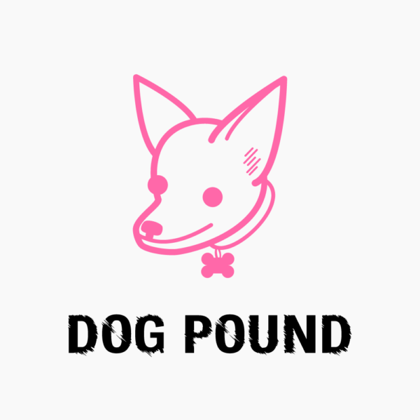
When considering which icon to choose, the two most important aspects to keep in mind are concept and execution. For example, say you run a gym called Dog Pounds, or, a dog walking agency called Fluffies. While the concept for both of these brands at a basic level is ‘dog’, what is clearly important is the type of dog (i.e. execution of the idea).
Case in point: Imagine someone at this gym hitting 10 250-pound reps on a bench, only to sit up and show this on their vest:
In contrast, picture your client as you go out of their apartment to pick up their award-winning chihuahua and you have this on the side of your car:
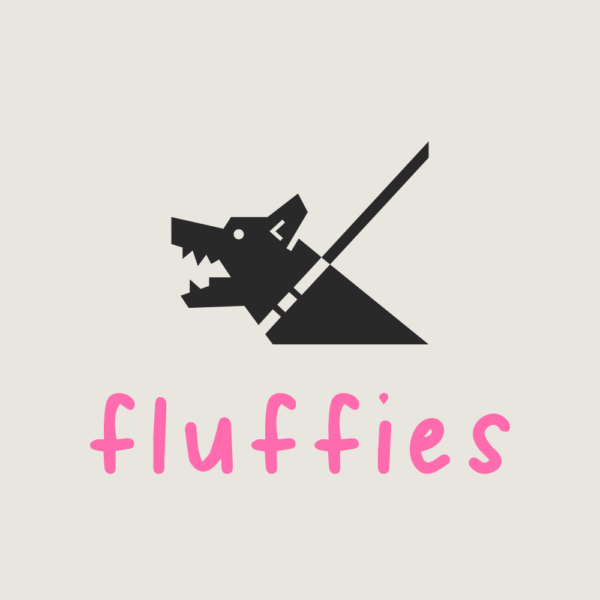
Please clarify why you chose a particular entity, in terms of the characteristics you want to convey, is there a better version of your logo symbol out there? This is why it helps to work with a selection of different versions of your icon as it allows you to compare the effects of each version.
Step five: review and edit
The completed logo icon needs to be reviewed again to see if it really suits your brand so that there are steps to adjust and edit accordingly.
Choosing a logo icon can seem like a daunting task, as this will be the symbol that represents your brand as a whole. Sometimes it’s tempting to try to get it right the first time but remember: choosing an icon for your logo is an ongoing process and even the biggest names go through many revisions. before they update the logo.
Finally, although they come in different shapes and sizes, the icons we’ve covered very quickly cover a set of core design principles that you can apply to your own logos:
- Is it simple?
- Is the logo relevant to the industry (directly or metaphorically)?
- Is it story or concept driving?
- Is it well done?If you are looking for a reputable and experienced place to design your logo, brand identity system and design your business’ branding strategy in an artistic and impressive way, then contact us. Contact us immediately by phone number 0938 835 856, or leave your information and requirements, THE MONEST‘s consulting department will contact you right away to answer all your questions!

