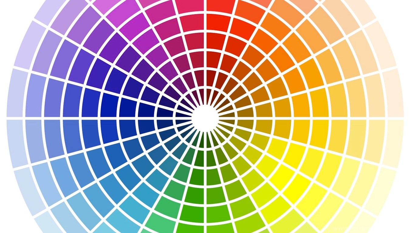
The color wheel is the basic element that helps us to perceive colors and is an effective method for assessing color harmony.
Color is the common language in design. It can help us convey brand personality, create a standout or evoke hidden emotions.
If you plan to apply color theory to your work, it will take a lot of practice to practice. This article covers the basics of color theory and how it applies to logo design, including how to achieve harmony using the color wheel.
However, this is only the tip of the iceberg. The nature of colors goes beyond what our eyes see, they are also practical when applied to logo design for different clients or brands.
Let’s explore 4 ways to work more effectively with color when designing logos.
1. Understanding color theory
When it comes to logo design or brand identity, the choice of color can play an important role and the aesthetic is not necessarily the most important thing. It is necessary to clearly understand the difference between the essence and the symbolism of color, which is quite different from the previous concepts of color.
Think about this when looking for design correlation. The nature of color is more of a barrier to overcome than a reference, especially when the request from the customer plays an important role.
Color symbolism is the next step, and cultural touches are a factor to consider. For example, red represents fortune and luck in China while white represents death. This is useful for brands that operate locally or regionally rather than globally. Coca-Cola is sold in China, but the red and white label is designed to convey the balance between money and death which is not quite right in this country.
The Partners’ Investec Journal project takes advantage of the association of the color red with fortune and luck according to the Chinese concept.
Color psychology delves into many aspects of an issue and focuses on the human response to perception.
In general, red represents instincts and emotions, being more material when compared to blue which seems cool and intellectual. Yellow represents light, dynamism, and sensibility, while green looks harmonious, natural, and balanced.
All of these associations are ambiguous and contain both positive and negative aspects. Tints, tones, and shades of color can be culturally and personally related, but the nature of the psychological effects are universal and should be considered part of the logo design process.
2. Choose a subtle method
There are many approaches when it comes to choosing colors for a brand, considering everything from pure hues to complex psychological and cultural associations.
Color psychologist Angela Wright worked out a system of color effects, which showed that all ranges of hues, opacity, and intensity could be grouped into one of four tonal groups. Colors of the same group, if combined, will create more harmony.

Group one: The use of bright red in Virgin’s logo exudes cheerfulness and youthfulness.
The first color group is clear, subtle, warm, and does not contain black. This group includes magenta, coral – pinkish-orange, blue and peach. They give us intimacy, freshness and optimism, so they are ideal for young brands, but otherwise create a feeling of awkwardness or lack of formality.
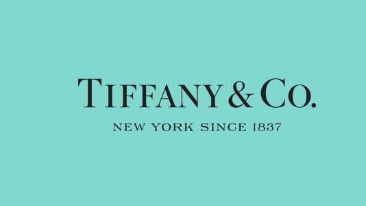
Group two: The robin egg blue in the logo of Tiffany & Co gives us a very trendy feeling.
The second group of colors appears darker, while also showing sophistication, typically dark brown, cinnamon or lavender purple. These colors exude style, grace and elegance for high-end brands, while also expressing a sense of separation, isolation and not often seen in logo design.

Group three: The Shell brand uses a combination of tomato red and earthy yellow to show strength.
The third group of colors brings warmth, depth and temper, often combined with black, such as burgundy, deep orange, olive and purple. This color scheme represents closeness and certainty, is often used to convey strength and integrity, but also carries many risks of being outdated or predictable.
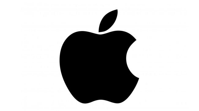
Group four: Apple uses pure black and white colors to give us a sense of fashion, smoothness and confidence.
Finally, the fourth color group is clear, strong and rustic, including black, white, magenta and lemon yellow. They exude confidence, efficiency and modernity, often used in tech brands but can be seen as expensive, utilitarian and cold.
3. Let’s put color in the market context
Choosing the right color for any brand is not only about cultural and psychological alignment but also about being competitive and keeping up with trends depending on the target group.
For example, two completely unrelated brands can use color to convey credibility, playfulness, or sophistication. But if their competitors use the same color for the same purpose, then standing out and being different is the deciding factor.
Indeed, owning a unique color for the brand is a difficult and unattainable task. Designing a logo to stand out on the phone screen is also increasingly important.
While other brands in the same segment use red, blue and bold colors, EasyJet offers a burst of orange.
Many brands do not follow the trends of the market but differentiate themselves by using striking colors that convey special values rather than blend in with the crowd: easyJet brings the freshness of those orange to the aviation industry, while Tango used black to create a craze for the juice brand.
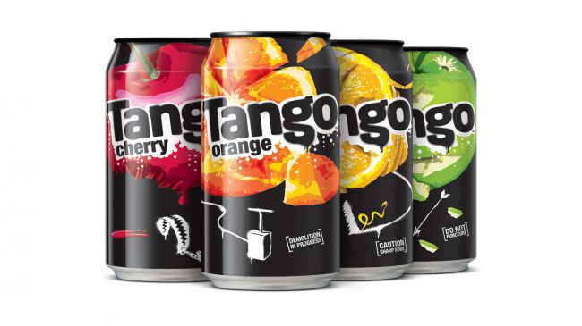
While Tango uses primary colors to classify flavors, the logo and can design are traditionally black.
However, such things are not always necessary. The use of dominant colors alongside primary colors is a never-ending debate in today’s bustling market, but with consideration when combining colors, diversifying the color cycle By adding millions of other ranges of colors or shades visible to the human eye, ownership becomes possible.
4. Consideration when presenting colors
Once your brand is selected, it is essential to review the rules of color schemes, on how to create and present them for real projects – especially when it comes to brand identity. See what you can achieve using the secondary color system (RGB for monitors) and the subtractive color system (CMYK for printing), and manipulate colors using HSB (hue, saturation, etc.) and brightness) or LAB (balance between two colors A and B, ‘A’ includes from green to red and ‘B’ from blue to yellow).
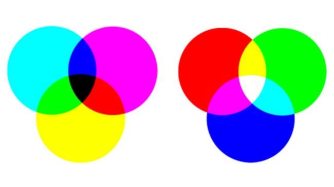
Similar to print and digital order, CMYK and RGB color palettes are both familiar to designers.
RGB and CMYK classify colors on a mechanical basis, and in fact, the way colors are presented is based on many reasons such as the color properties of a certain device. HSB is more intuitive, theoretically classifying colors based on the color wheel.
Meanwhile, LAB has almost absolute accuracy and does not rely on machines because it is mainly the representation of colors, not just calculations. This is extremely important when it comes to accurate color schemes in multitasking platforms.
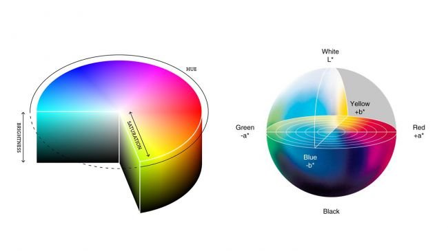
HSB and LAB color palettes give more accurate results, based on how colors are depicted and perceived.
Of course, if you choose to define your brand in print using one or more color palettes (Pantone), accurate color matching on digital devices will be more feasible, so consider this.
If you are looking for a reputable and experienced place to design your logo, brand identity system and design your business’ branding strategy artistically and impressively, then contact us. Contact us immediately by phone number 0938 835 856, or leave your information and requirements, THE MONEST’s consulting department will contact you right away to answer all your questions!

