The circle is a safe and extremely recognizable shape, a shape that signifies unity, stability, and wholeness, is the shape of the earth and the sun, the link between the planet and the planet, crystal and nature. This is also one of the shapes that are used a lot in logo design, from famous brands in the world. If you are wondering how to apply circular logo design for your brand, don’t ignore the tips that The Monest shares below!
1. 5 famous circular logos in the world:
In logo design, a circle or circle can be used as a symbol, a monogram in a logo, or as the shape in which the entire logo exists. To discover what makes a good circular logo design and help you decide whether to choose one for your business, let’s take a look at a few circular logos from a few well-known brands. In the world.
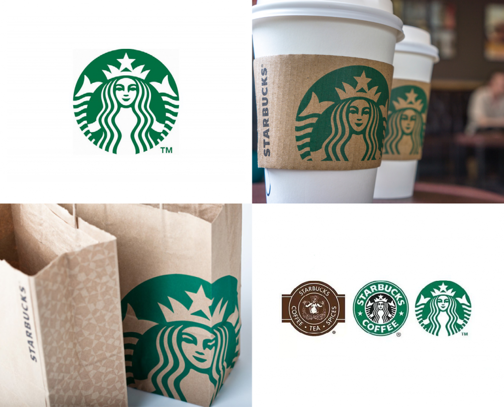
#1 Starbucks
Starbucks is a recognizable brand and they decided to remove the wording from their logo in 2011. The famous mermaid image now with a slightly asymmetrical face – still kept within a colored circle. Green and badge designs are everywhere, from coffee cups, bags, to signage, etc.
Why does it work? When you are just starting out in business, it can be difficult to achieve brand identity without the text in your logo. But because Starbucks has been around for so many years, its brand can stand on its own. Only branding will enhance the strength of a logo for the purposes of extension, legibility and functionality. Starbucks doesn’t have to worry about having a different logo across platforms or apps. And the brand is not afraid to use an off-center placement on its packaging.
#2 Nivea
Nivea released a new circular logo in 2013. A white lettering sign set in a dark blue circle is reminiscent of the brand’s classic body lotion box. While the rectangular logo previously left an indelible impression on the packaging, the circular blue logo design is instantly recognizable and has a classic (yet modern) appeal.
![]()
Why does it work? Most Nivea products have circular target areas, whether it’s bottle caps or tin can screw caps. When the company decided to rebrand with a circular logo design, it perfectly matched its products. When you look at the updated products, it seems that the packaging and logo were designed together to keep the brand identity. And when you see that dark blue circle, you think of Nivea. Truly, a perfectly circular logo!
#3 Pinterest
When Pinterest updated its wordmark to a sans-serif font in 2017, its “P” badge remained. (It’s also the red circular logo seen by most users through the app.) The lettered “P” looks attractive and slightly imperfect, with the end of the letter piercing through the section bottom of the circle.
![]()
Why does it work? Pinterest launched with a script word mark and a circular monogram “P” in the same typeface. This logo design means that when you see each element on its own, you can easily link them together.
However, because Pinterest has developed a strong brand identity over the years – and the monogram “P” is now recognizable. The company was able to rebrand and use a more modern sans-serif typeface for its lettering while keeping its famous red badge.
#4 BMW
BMW has one of the most iconic icons in the world, and the design underwent an overhaul in 2020. The gradient and 3D elements have been removed for a minimalist face. later paired. The result is a logo that’s more retro and looks better in print, too. The blue and white design is inspired by the Bavarian flag and is a good example of a monogram that curves into a circle.
![]()
Why does it work? BMW has kept its logo consistent for over 100 years because it follows basic design principles: contrast, hierarchy, legibility and extensibility. You can clearly distinguish each logo element from the other. The monogram is a bold sans-serif typeface, making it the most dominant element of a logo (like a company name). And when scaled down, the text is still legible – a very important thing to think about when creating a logo!
#5 Beats
The logo of the Beats headphones is another great example of a circular logo. The space used to identify a lowercase “b” is intentionally duplicated as a headphone symbol. The logo is clean, subtle, and uses a classic red and white color combination to create a powerful impact.
![]()
Why does it work? The simplicity of the Beats logo is what defines it. With no wordmarks or elements added, it’s easy to scale and place on the product. As wireless headphones get smaller and smaller, this circular logo should have no trouble shrinking while still being noticeable.
2. Circle logo design tips
From the examples of circular logo designs by famous brands in the world, one can see that circular logos have many variations, some include the company name in the shape (like Nivea and BMW), and some are outside of it (like Pinterest).
If you are thinking of designing a circular logo, first answer a few questions for yourself:
– Why do you want a circular logo design? Go beyond “it looks interesting” or “my wordmark looks boring” and think about how shapes can strengthen your brand and business, as seen in the examples above.
– Will your company name fit in the circular container and will it be legible when scaled down? If not, are you willing to use initials or monograms in a circle with your company name next to it, or warp the text to better fit the space?
– Do you prefer a solid, full circle icon like Nivea’s or a circular outline?
– Do you want the circle to include only a wordmark/monogram or a logo (like BMW)?
Once you know the type of logo you want and why you want it, check out these design tips and examples.
![]()
Tip #1: Keep it short
Using horizontal text in circular logos? Your company name should be 1-5 characters long, max. If not, use an acronym or abbreviation in the circle and place the wordmark next to it, as seen in the example above.
This wordmark has three words and a monogram containing the first letter of each word, using circular space wisely. Make sure your typeface fits the circle and adjust the spacing to use as much space as possible while still having padding along the edges.
The goal is not to have a lot of white space – and to keep your logo legible when scaled down. Think about what your logo looks like as a favorite icon, social media profile picture, or on a business card. You want a design that looks clean and easy to read across all channels.
When you have a long company name and don’t fit in small spaces, a circular monogram can be a smart addition to your wordmark. Why? Many of the platforms you use your logo on requiring it to be square and the circles fit inside the squares without leaving too much negative space.
![]()
Tip #2: Aim for brand consistency
If you decide to include a wordmark in your logo along with a circular monogram, keep the typography in both the wordmark and monogram to reinforce brand recognition.
Choosing the right typeface also has a big impact on your monogram. In the example above, we’ve used a bold sans-serif typeface for readability at any size and recognizable thanks to the triangles on each character.
Using a distinct typeface within a monogram makes it much easier for someone to relate it back to your main logo. If you choose a thinner typeface in a circle that isn’t obvious when scaled down, your logo won’t work – and you’ll revert to square.
![]()
Tip #3: Create a visual hierarchy
When designing a circular logo, think about what elements will become part of the logo. One of the first things people think about is adding elements to fill the space, but in reality, makes the design look unattractive and unprofessional. You want to use space wisely to create a visual hierarchy.
The logo example above contains six different elements: company name, tagline, monogram, year, symbol, and container.
Since there are many elements to work with, curving the text in the company name and tagline provides plenty of space for other elements. The monogram is right in the middle to draw attention to the company’s name.
Again, choose a typeface that is easy to read and contrasts when scaled down to a small size; bold, sans-serif fonts work best.
If you are looking for a reputable and experienced place to design your logo, brand identity system and design your business’ branding strategy artistically and impressively, then contact us. Contact us immediately by phone number 0938 835 856, or leave your information and requirements, THE MONEST’s consulting department will contact you right away to answer all your questions!
————————
THE MONEST
Website: www.themonest.vn
Fanpage: https://www.facebook.com/themonest.agency
Behance: https://www.behance.net/themonestagency
LinkedIn: https://www.linkedin.com/company/the-monest-agency/
Instagram: https://www.instagram.com/themonest.agency/
Hotline: 0938 835 856
#LogoTheMonest #CIPTheMonest #StationaryTheMonest #BrandIdentityTheMonest #Painting
#PaintingTheMonest #InstalationArtTheMonest #DieuKhacTheMonest #XayDungThuongHieu #TheMonestXayDungThuongHieu #ThietKeThuongHieu #TheMonestAgency #ClientTheMonest #HoihoaTheMonest #ArtTheMonest #BrandAgency #DesignAgency #TheMonestDesign #ThuongHieuVaDiSan #Branding #DesignAgency #PackagingDesign #HoiHoa #AdvertisingAgency #LogoDesign

