ITI FUND
ITI FUND is an innovation-centric venture capital vehicle instituted under the aegis of the 4M Group. The fund was established with a mandate to catalyze synergistic growth alongside Startups operating at the vanguard of Technology and Sustainable Development (ESG). Concurrently, ITI FUND is steadfast in its ambition to propel Vietnam’s intrinsic value propositions onto the global theater.
Client: ITI FUND (Increase – Together – Innovation Fund)
Industry: Venture Capital & Financial Services
Timeline: 2021
Location: Ho Chi Minh City, Vietnam
Hạng mục công việc: Đặt tên thương hiệu, Sáng tác Slogan và Câu chuyện thương hiệu, Thiết kế Logo và Thiết kế Website.
CLIENT OBJECTIVES
The creative startup investment fund, ITI, sought a strategic partner capable of deciphering their commercial architecture and engineering a brand narrative congruent with their corporate trajectory—serving as a dedicated companion to Tech Startups.
Given the rigorous parameters inherent to the Financial sector, the visual identity system required a sophisticated synthesis: it had to project the institutional stability of a financial entity while subtly interlacing the motifs of ‘Technology and Sustainable Development’ to authentically articulate the enterprise’s DNA.
CHALLENGES FOR THE MONEST
Architecting brand equity within the Financial sphere demands profound sectoral acumen to ensure the transmission of a lucid commercial message that engineers fiduciary confidence and trust among stakeholders.
Consequently, The Monest’s strategic imperative was to intuitively grasp the industry’s nuance, leveraging creative innovation to crystallize the enterprise’s core values. Our goal was to deploy a visual language that transmits a potent message, profoundly influencing public cognition and market perception.
BRAND NOMENCLATURE STRATEGY
Mnemonic retention and sectoral resonance serve as the twin pillars of The Monest’s naming architecture, all while strictly adhering to the client’s long-term corporate trajectory.
Using these criteria as our strategic compass, we conceptualized the designation: “Increase – Together – Innovation Fund (ITI FUND).” This nomenclature encapsulates a mandate for synergistic growth, positioning the Fund not merely as a financier, but as a catalyst for co-creation and societal advancement.
TAGLINE DEVELOPMENT (SLOGAN)
We engineered a linguistic synthesis of the investment focus (“Start-Up”) and the vision of collective elevation (“Up Together”). Leveraging the lexical convergence of the suffix “Up,” the resulting tagline constructs a cohesive narrative with dual-layered semantic meaning, reinforcing the symbiotic bond between the fund and its ventures.
LOGOMARK ARCHITECTURE
Recognizing that the logo must serve as a visual anchor of institutional gravitas, The Monest architected a design based on geometric solidity. We intricately interlocked the characters I – T – I within a quadrilateral form to symbolize a “foundational sanctuary” for Startups. Furthermore, the aspirational momentum is encoded within the design’s negative space. This subtle visual nuance depicts an upward trajectory, signifying the parallel evolution and future-forward vision shared between ITI FUND and its portfolio partners.
The ITI Innovation Fund was instituted with a clear mandate: to act as a catalyst for nascent enterprises, thereby fortifying Vietnam’s startup ecosystem and propelling domestic ventures to a position of global prominence. Deciphering the Fund’s strategic intent within the Vietnamese market, The Monest architected a brand narrative strictly anchored upon the core tenets of ‘Symbiosis’ and ‘Co-creation’. Consequently, we crystallized a story of a venture capital entity that provides unwavering stewardship, standing shoulder-to-shoulder with Startups throughout their arduous commercial odyssey.
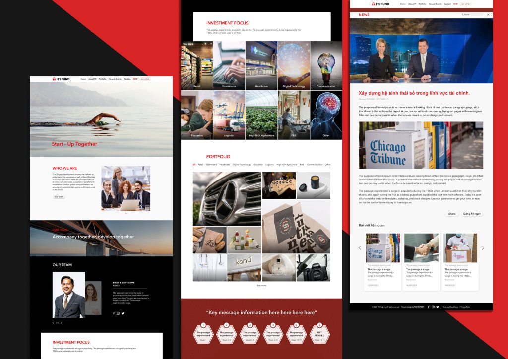
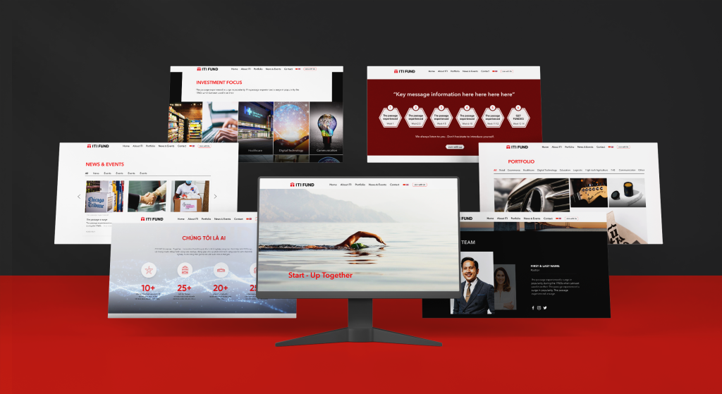
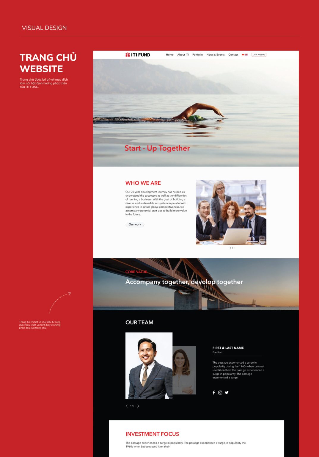
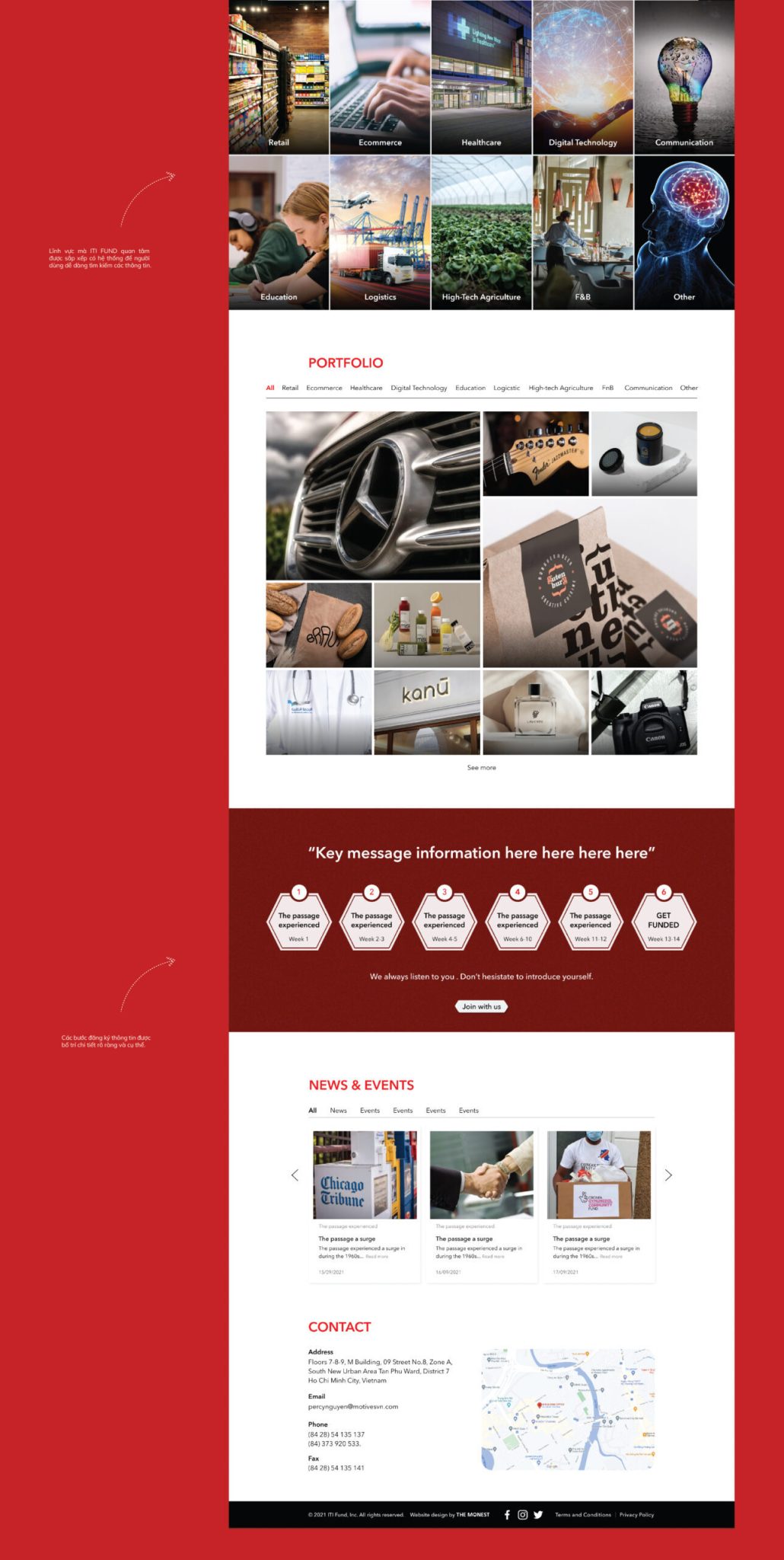
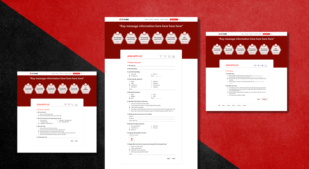
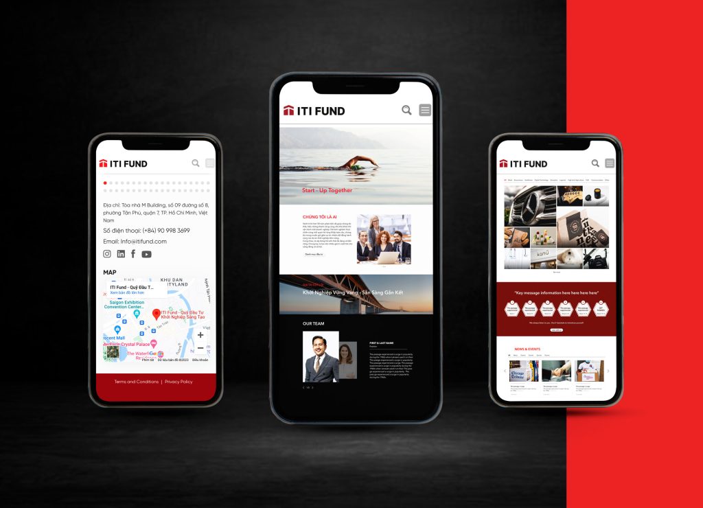
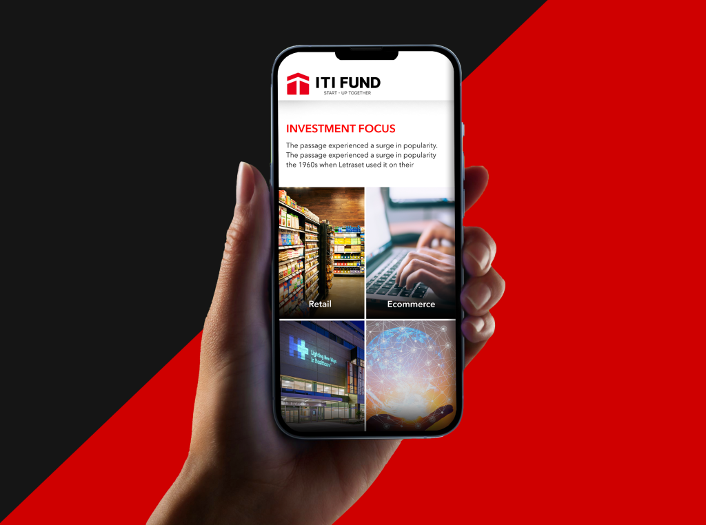
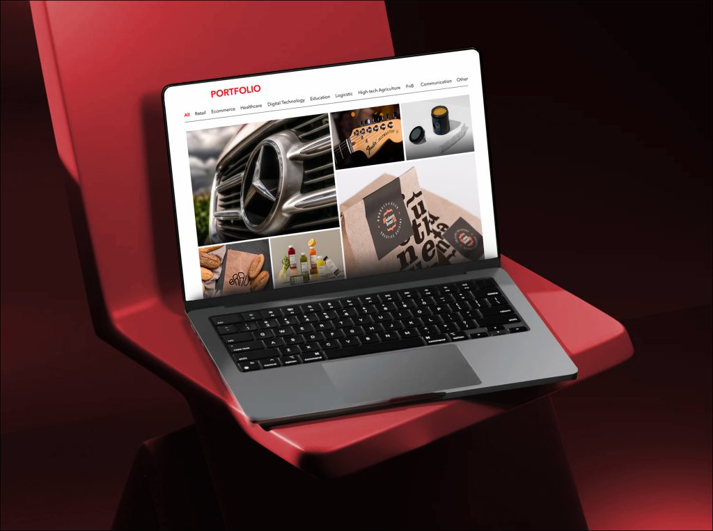
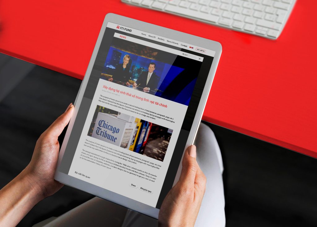
WEB INTERFACE ARCHITECTURE & STRATEG
By integrating the client’s vision with rigorous research into financial user habits, The Monest delivered a web experience that balances informational depth with approachability. The result is a digital ecosystem that instills fiduciary confidence and professionalism at first glance.
Our team executed a strategic arrangement of the visual hierarchy, optimizing the layout to facilitate effortless information retrieval and maximize user engagement. Additionally, strict adherence to the visual identity system—unifying chromatic schemes, fonts, and branding assets—was prioritized to maintain a monolithic brand voice across the digital landscape.