PACKAGING DESIGN – VAN DOUGH
Van Dough is a premium brand within an Australian-based bakery chain. With years of expertise in the bakery industry, Van Dough possesses proprietary processes and artisanal recipes that create the unique flavors found in their diverse range of products—from traditional breads, croissants, and savory pies to signature doughnuts and various specialty pastries. To achieve this excellence, Van Dough’s artisans meticulously oversee every stage of production, from kneading and shaping the dough to the final bake. This dedication ensures that every product reaching the customer is fresh, fragrant, and served warm daily.
Client: VAN DOUGH (a member of Saigon F&B Group)
Industry: Bakery & Retail
Project Duration: 2021 – 2022
Location: Brisbane, Australia
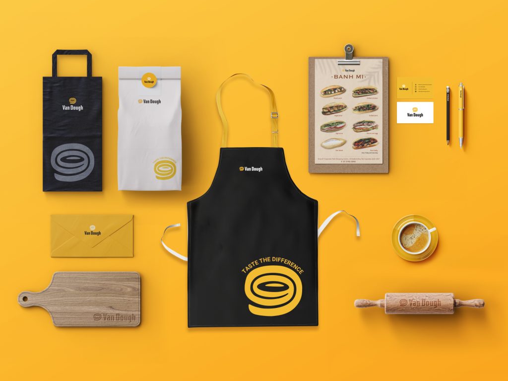
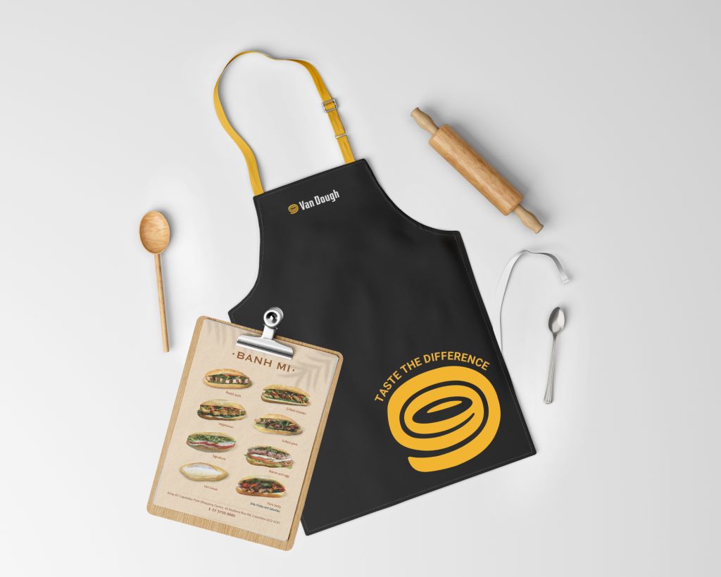
Scope of Work: Brand strategy & positioning, logo design & slogan creation, product packaging design, operational identity system for chain store management, communication strategy & execution, posm & social media design, construction support & grand opening activation
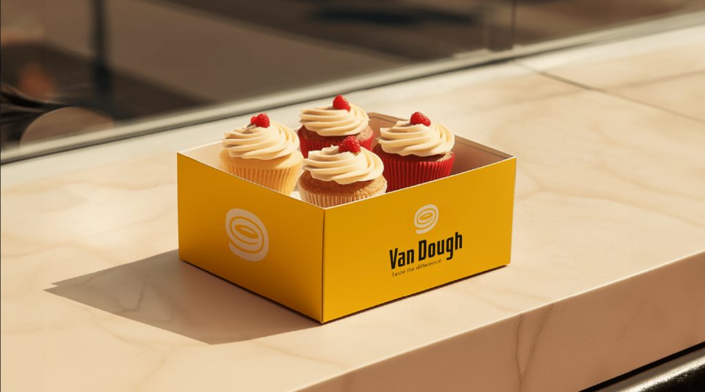
Presented Scope: Product packaging design; brand identity system design for the chain’s branch operations.
VAN DOUGH’S VISION
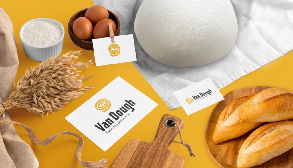
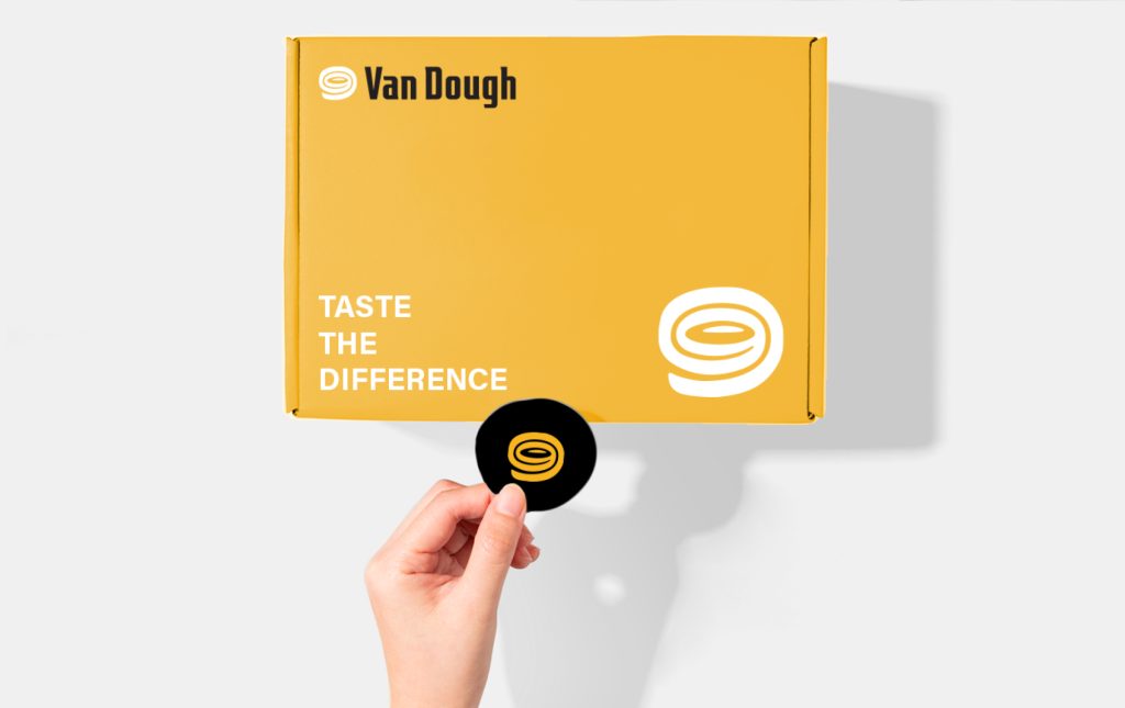
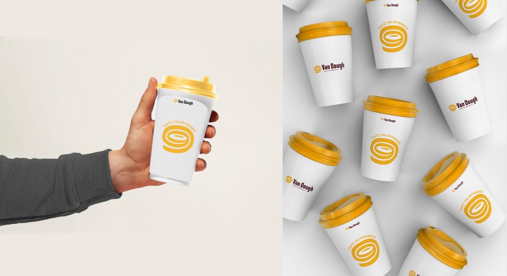
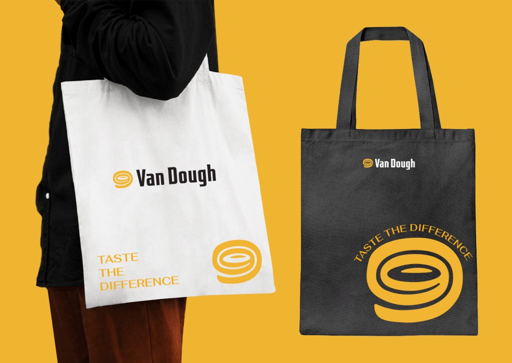
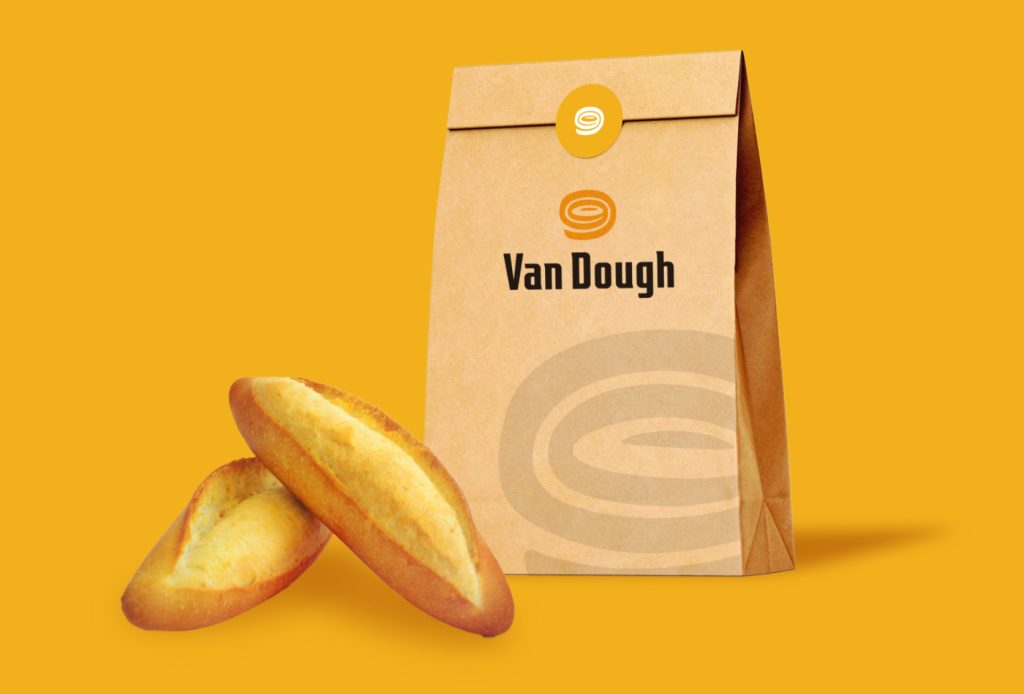
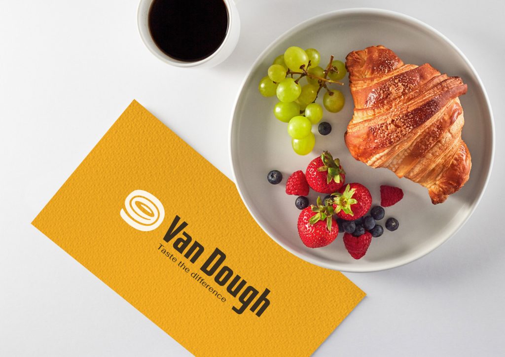
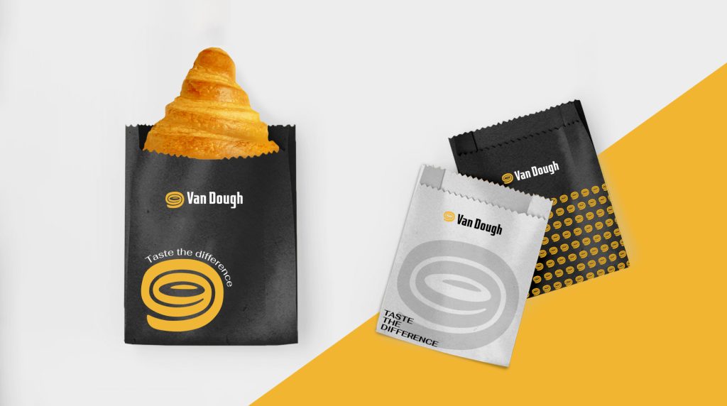
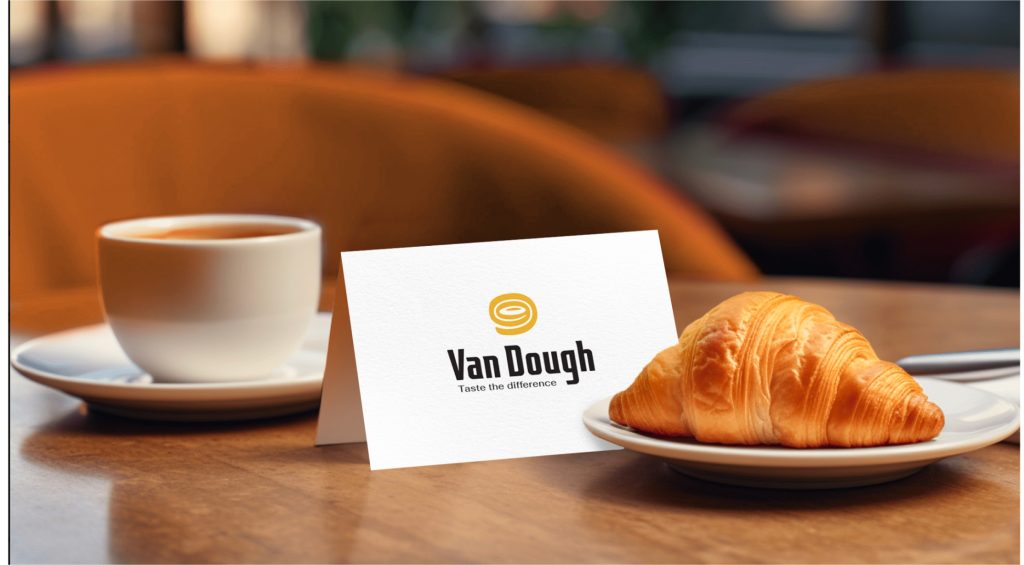
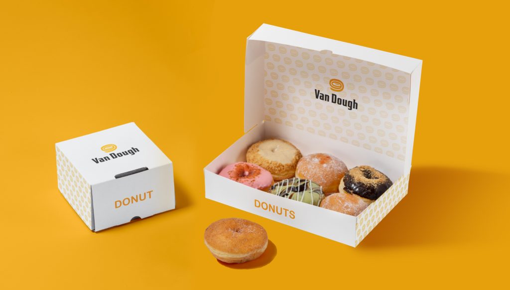
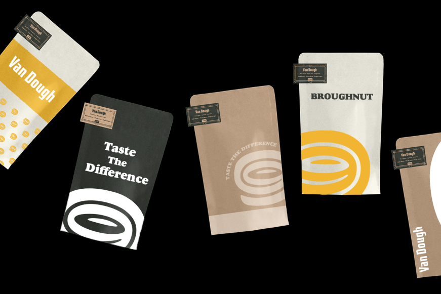
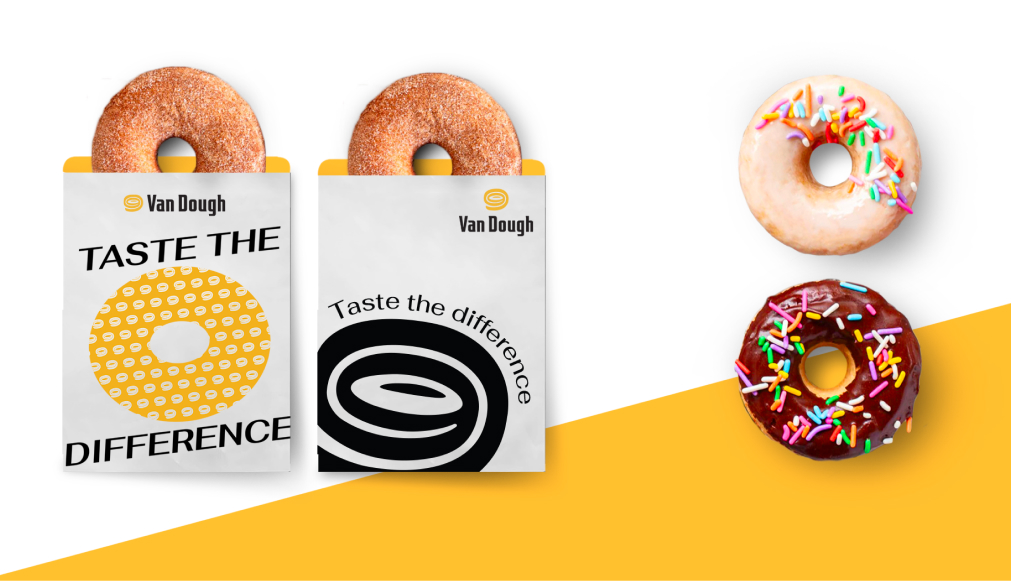
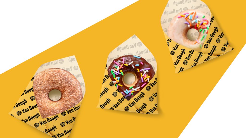
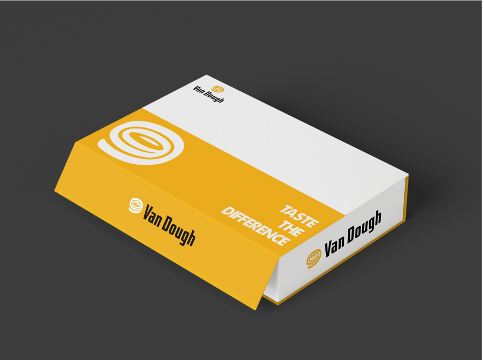
Following the successful logo design collaboration with THE MONEST Agency, Van Dough has extended the partnership to develop the brand’s Stationery and Product Packaging. Van Dough’s primary objective is to achieve seamless visual cohesion across the brand identity and packaging suites, anchored by a consistent color palette and the prominent integration of the brand logo.
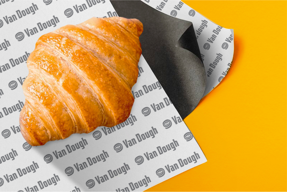
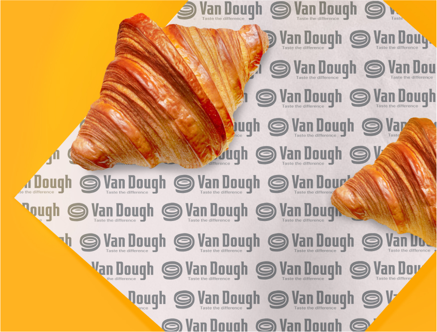
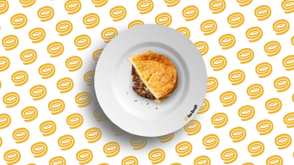
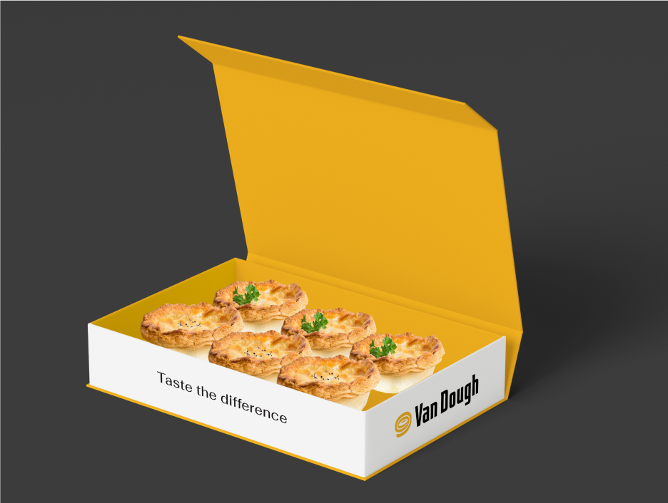
Furthermore, the packaging design must demonstrate high compatibility with the specific nature, characteristics, and physical structure of each product line. This required an in-depth exploration and comprehensive understanding of the diverse pastry offerings within the Van Dough menu.


CHALLENGES FOR THE MONEST
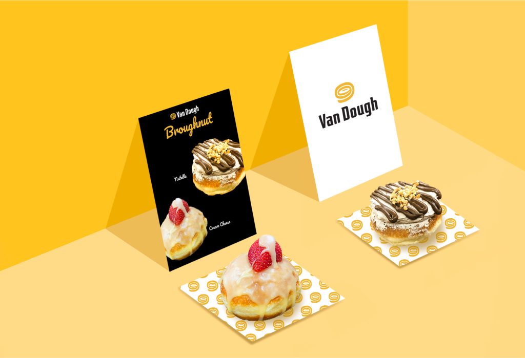
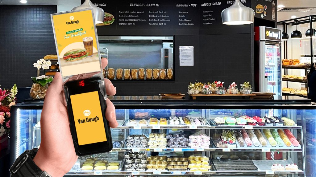
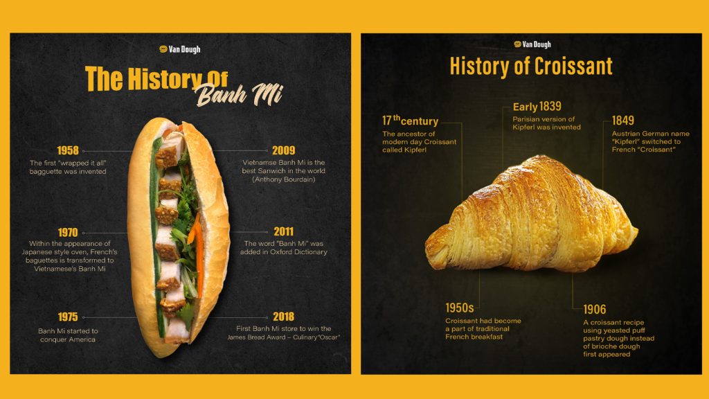
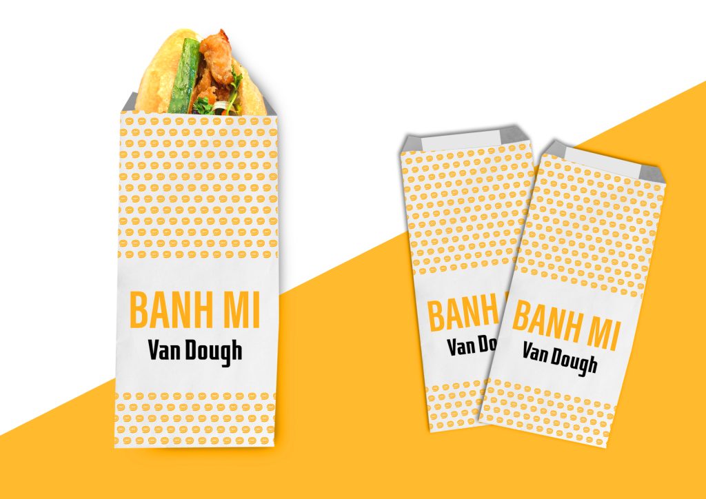
Van Dough’s product range is exceptionally diverse, featuring traditional Vietnamese Bánh Mì, French Croissants, and Dutch Doughnuts. Each product represents a distinct cultural heritage and national identity; therefore, the design had to accentuate these unique origins while maintaining brand unity.
To address this, THE MONEST Agency team conducted extensive research and firsthand product tastings to fully appreciate the flavor profiles and identify the specific occasions for which each product is intended. By gaining a clear sensory understanding and contextual insight, the team developed design solutions that precisely aligned with the client’s expectations and the brand’s premium positioning.
THE IMPLEMENTATION PROCESS
Armed with a clear understanding of Van Dough’s requirements and a deep dive into their existing product lines, THE MONEST Agency proposed a comprehensive Brand Identity and Packaging suite. Each design was meticulously crafted to meet rigorous standards: reflecting the true nature of the products, ensuring consistency in color and structure, and maintaining precise layout execution.
FEEDBACK FROM VAN DOUGH
Upon the completion of the project phases, our team was delighted to receive highly positive feedback from Van Dough. Client satisfaction serves as the primary motivation for THE MONEST Agency to continue evolving, ensuring we consistently deliver products that embody our core philosophy: “ACCURATE & AESTHETIC.”